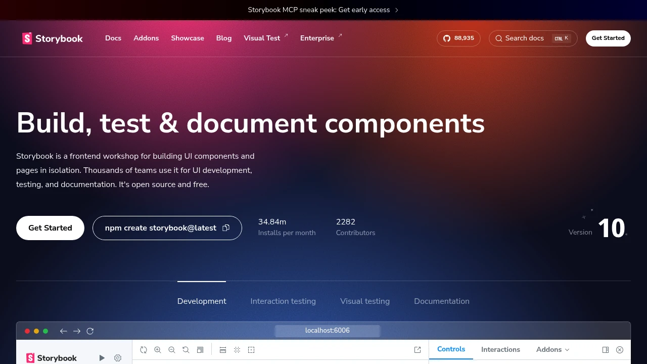
Build UIs without the grunt work
Storybook is the industry-standard tool for developing UI components in isolation. Build, document, and test components independently of your application.
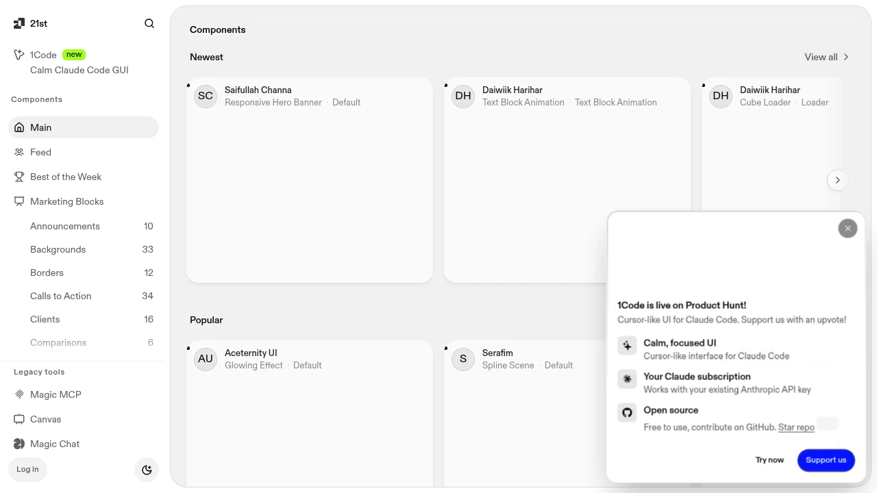
The NPM for design engineers
21st.dev is a community-driven library of React components for design engineers. Browse, discover, and use beautiful components from talented creators.
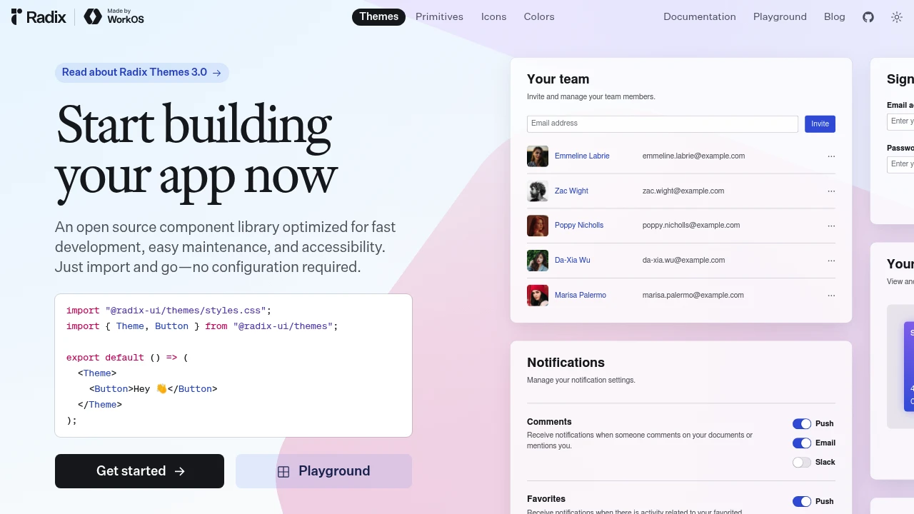
Unstyled, accessible UI primitives
Radix UI provides unstyled, accessible React primitives for building design systems. Handle the hard parts—accessibility, keyboard navigation—so you can focus on design.
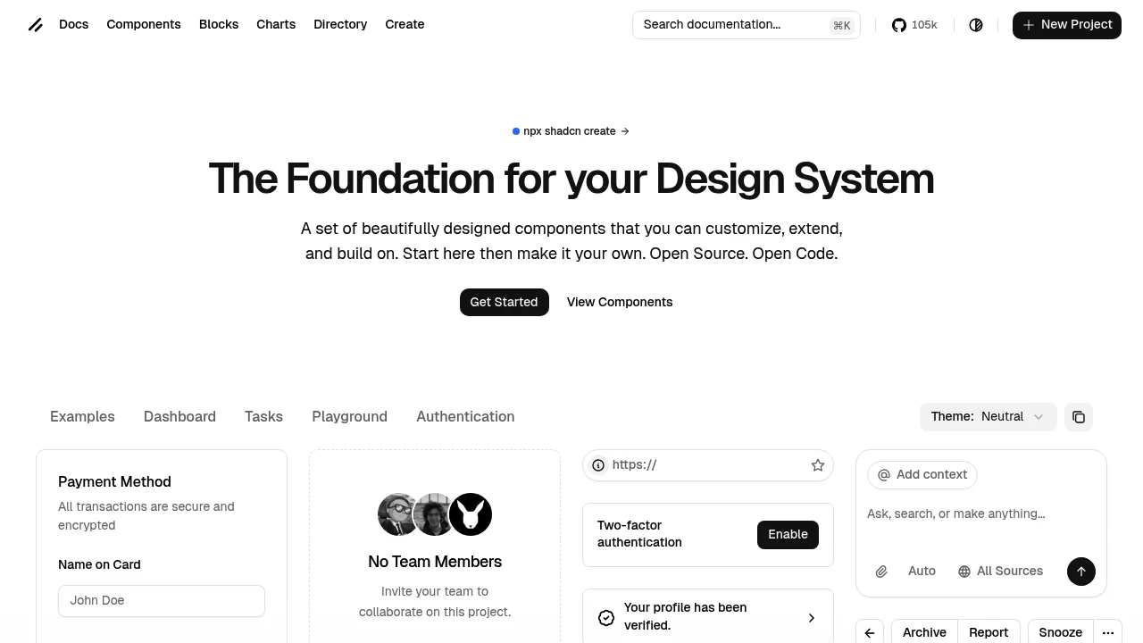
Beautifully designed components that you own
shadcn/ui provides copy-paste React components built on Radix UI and Tailwind CSS. Not a library—components you add to your codebase and customize freely.
The mobile SDK for the web
Cross-platform mobile UI toolkit with native-style components.
Headless UI components for React, Vue, and Solid
Ark UI provides unstyled, accessible components powered by state machines. Predictable behavior across frameworks with fine-grained control.
UI library for design engineers
Magic UI provides animated React components for landing pages and marketing sites. Beautiful motion design that makes pages feel alive.
React components to build charts and dashboards
Tremor provides React components specifically designed for dashboards and data visualization. Charts, KPIs, and data tables—everything for building analytics interfaces.
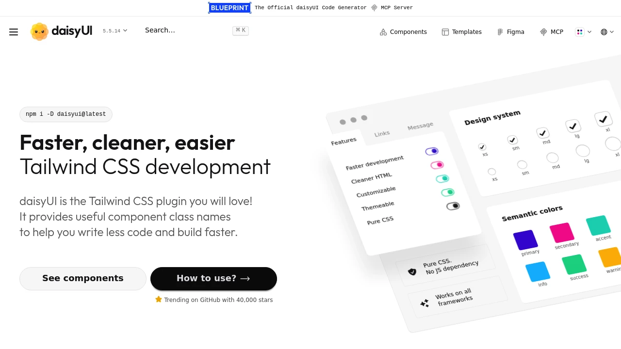
The most popular Tailwind CSS component library
DaisyUI adds component classes to Tailwind CSS. Write semantic class names instead of utility combinations—faster development with Tailwind's flexibility.
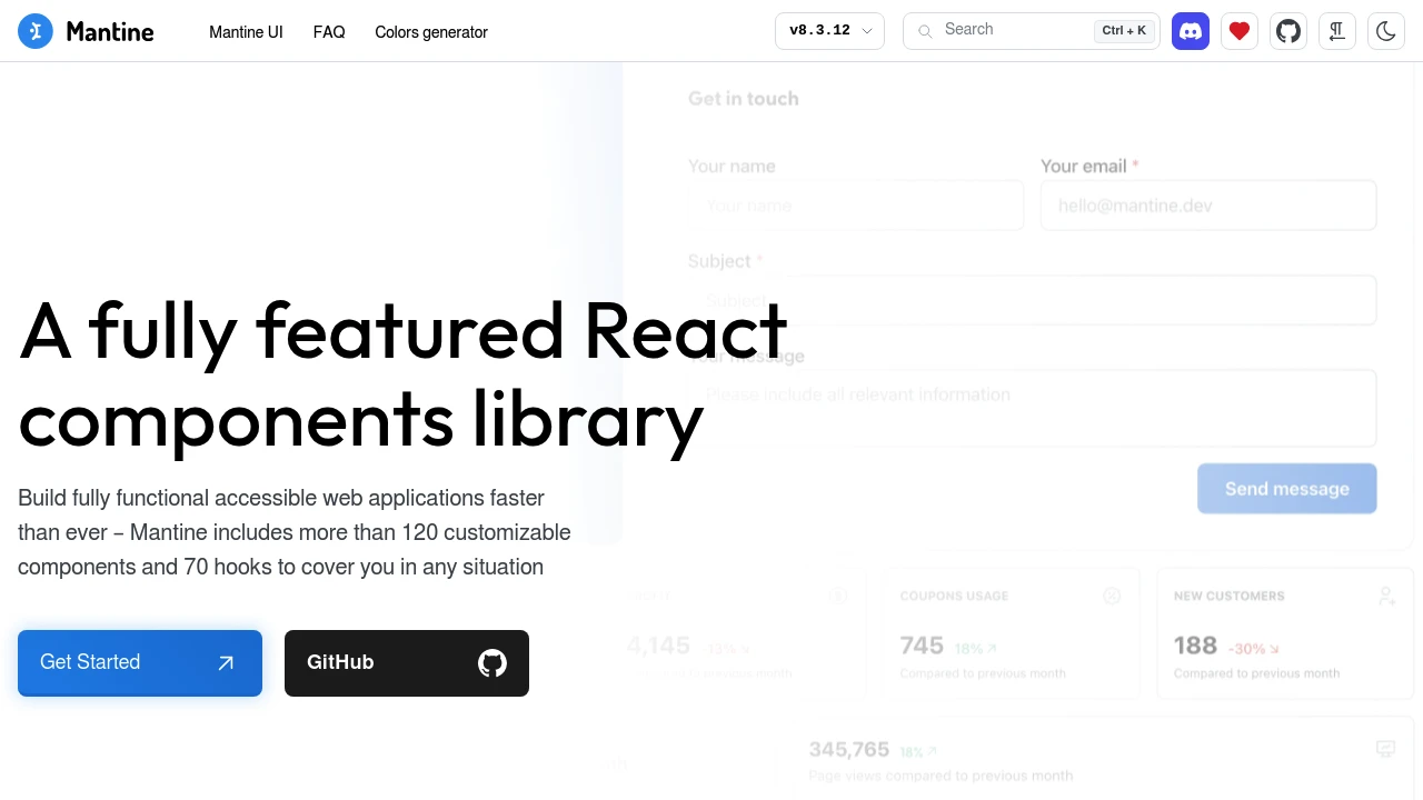
A fully featured React components library
Mantine provides 100+ hooks and components with excellent TypeScript support. Forms, dates, notifications, rich text—everything you need in one library.
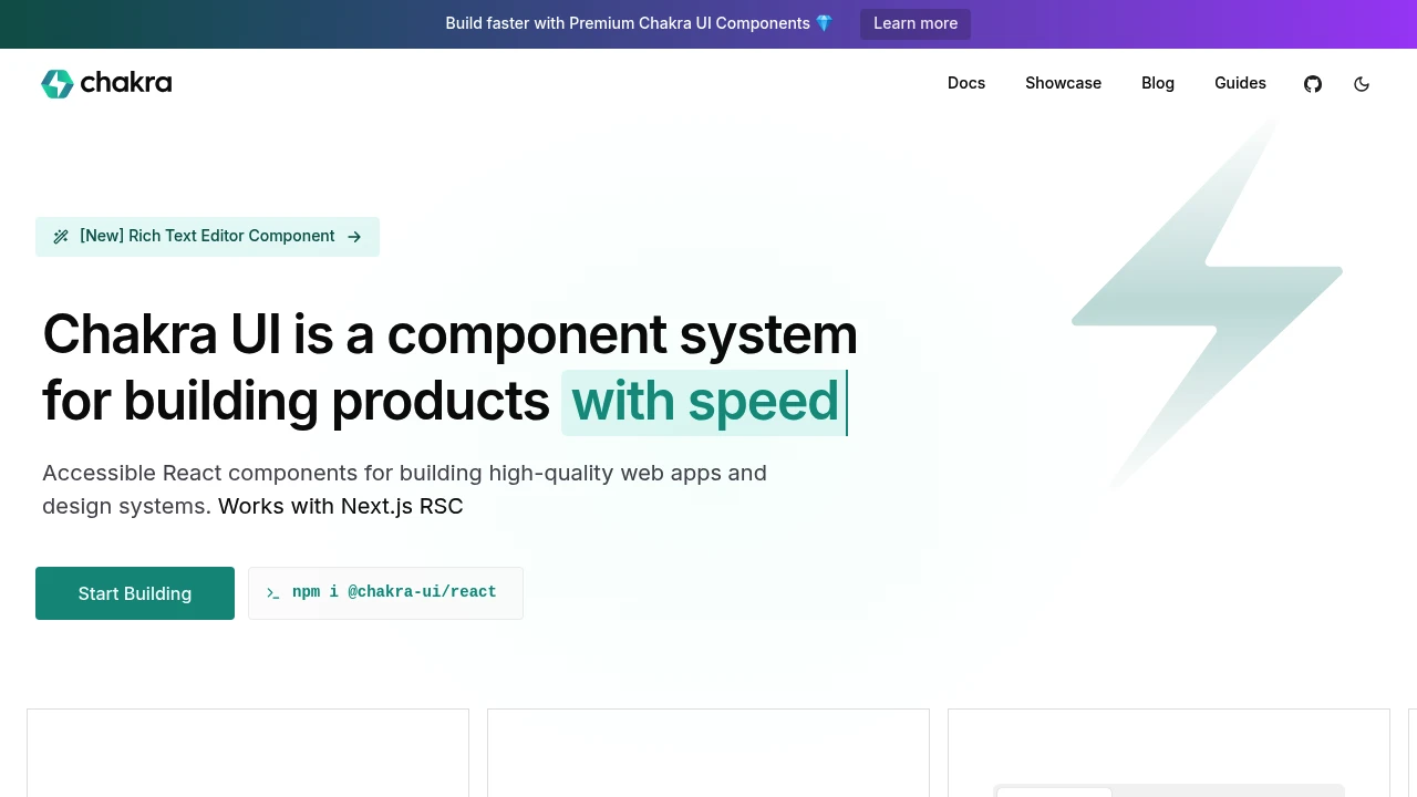
Simple, modular and accessible React components
Chakra UI provides styled, accessible React components with a prop-based API. Build interfaces quickly with sensible defaults and easy customization.
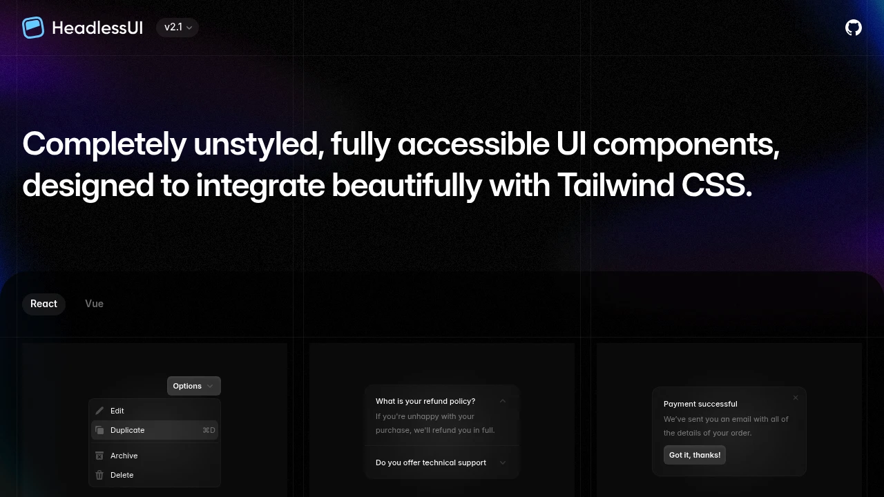
Completely unstyled UI components from Tailwind
Headless UI provides unstyled, accessible UI components designed for Tailwind CSS. From the creators of Tailwind—components that integrate perfectly with utility classes.
 Your brand here