Storybook
Storybook is the industry-standard tool for developing UI components in isolation. Build, document, and test components independently of your application.
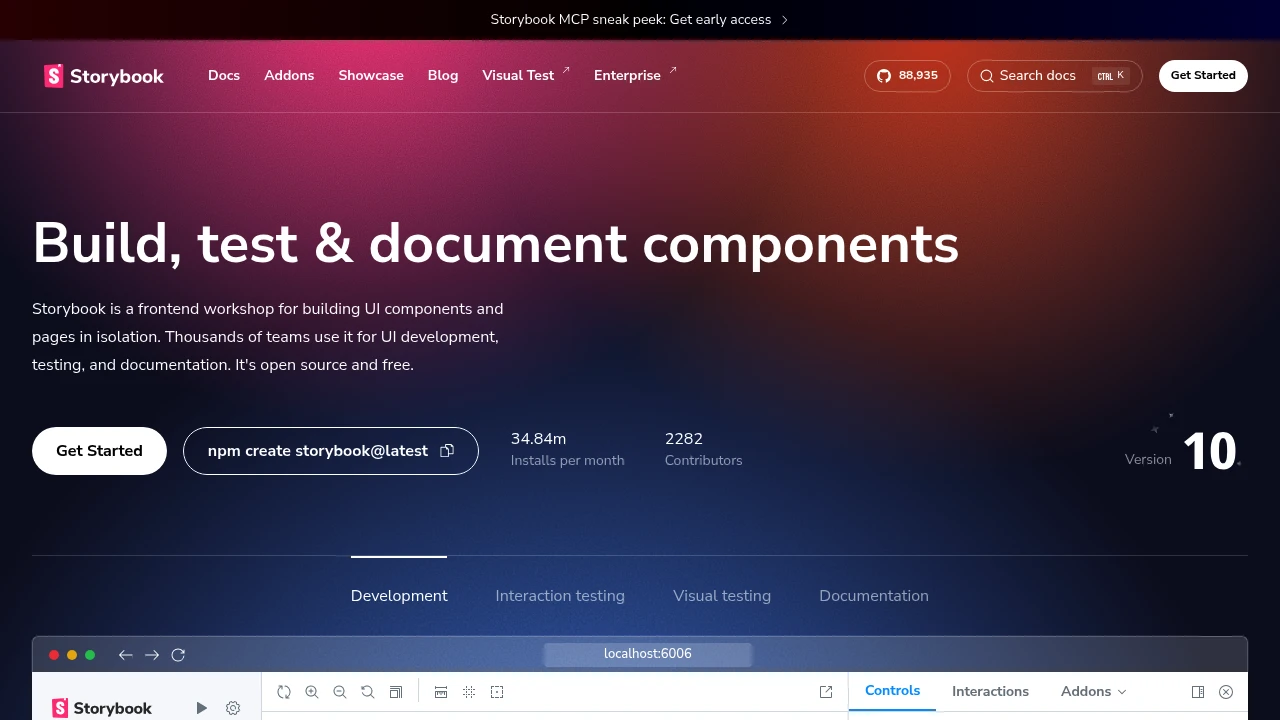
Storybook has become essential infrastructure for UI development. Develop components in isolation, document them automatically, and test visual consistency—all in one tool.
Key Features:
- Component Isolation - Build without running the full app
- Documentation - Auto-generated component docs
- Visual Testing - Catch UI regressions
- Addons - Extensive plugin ecosystem
Why teams use Storybook:
- Faster Development - Work on components without app context
- Living Documentation - Always up-to-date component library
- Collaboration - Designers and developers share a source of truth
- Quality - Visual regression testing catches bugs
Storybook capabilities:
- Controls - Interactive prop editing
- Actions - Log component events
- Viewport - Responsive design testing
- Accessibility - Built-in a11y testing
Storybook is particularly valuable for teams building design systems or applications with many shared components. The investment in stories pays off in documentation, testing, and development speed.
Categories:
Ad

 Emergent — An agentic vibe-coding platform that builds production-ready apps