DaisyUI
DaisyUI adds component classes to Tailwind CSS. Write semantic class names instead of utility combinations—faster development with Tailwind's flexibility.
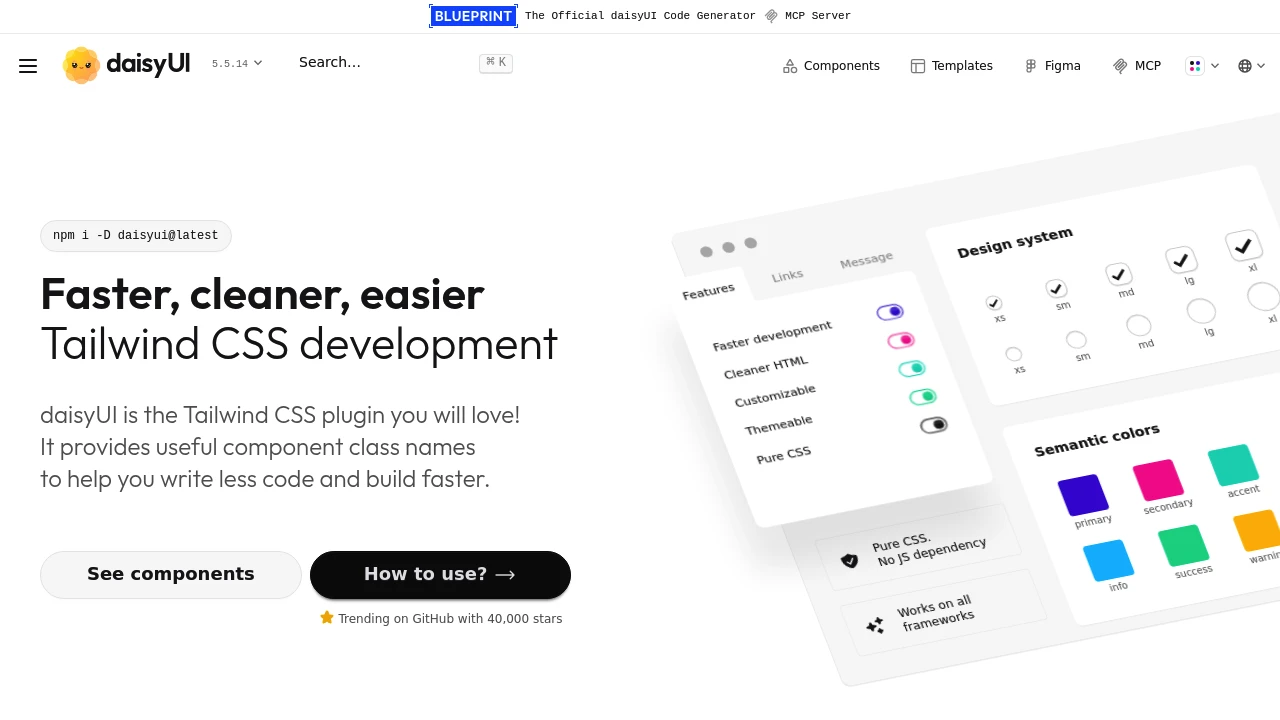
DaisyUI extends Tailwind CSS with semantic component classes. Instead of combining dozens of utilities, write btn btn-primary and get a styled button. Tailwind's power with component-level convenience.
Key Features:
- Component Classes - Semantic names like
card,modal,btn - 30+ Themes - One-line theme switching
- Tailwind Compatible - Utilities still work alongside
- Framework Agnostic - Works with any framework
Why DaisyUI:
- Faster Development - Less utility combining
- Readable Markup - Clear class names
- Theming - Beautiful themes included
- Lightweight - Just CSS, no JavaScript
DaisyUI components:
- Actions - Buttons, dropdowns, modals
- Data Input - Forms, checkboxes, ranges
- Data Display - Cards, tables, stats
- Layout - Navbar, footer, drawer
DaisyUI is perfect for rapid development with Tailwind. The semantic classes speed up common patterns while Tailwind utilities remain available for custom needs. Great for prototypes and projects prioritizing speed.
Categories:
Tags:
Ad

 Emergent — An agentic vibe-coding platform that builds production-ready apps