Headless UI
Headless UI provides unstyled, accessible UI components designed for Tailwind CSS. From the creators of Tailwind—components that integrate perfectly with utility classes.
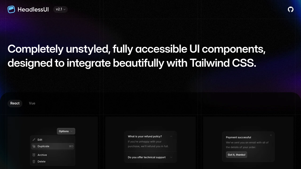
Headless UI comes from the Tailwind CSS team—unstyled, accessible components designed to work perfectly with utility classes. It's the official primitive library for Tailwind-based design systems.
Key Features:
- Tailwind Optimized - Designed for utility-class styling
- Fully Accessible - Keyboard and screen reader support
- React & Vue - Support for both frameworks
- Minimal API - Simple, predictable interfaces
Why Headless UI:
- Tailwind Native - From the same team, perfect integration
- Simple Patterns - Consistent API across components
- No Conflicts - Works seamlessly with Tailwind classes
- Lightweight - Only the primitives you need
Components included:
- Menu - Dropdown menus with keyboard support
- Listbox - Select inputs with full accessibility
- Dialog - Modal dialogs with focus management
- Disclosure - Expandable sections
- And more - Growing library of primitives
Headless UI is the natural choice for teams already using Tailwind who want accessible primitives without adopting a larger system like Radix.
Categories:
Ad

 Emergent — An agentic vibe-coding platform that builds production-ready apps