Radix UI
Radix UI provides unstyled, accessible React primitives for building design systems. Handle the hard parts—accessibility, keyboard navigation—so you can focus on design.
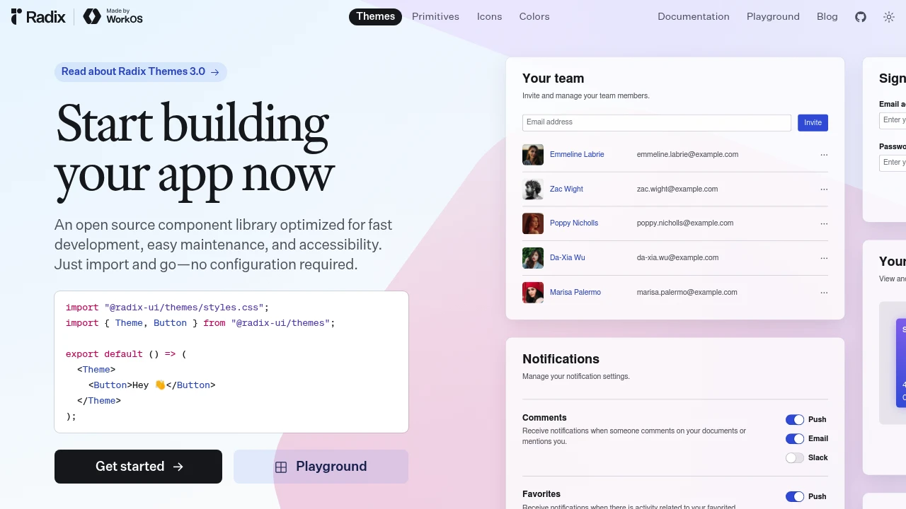
Radix UI provides the accessible foundations that shadcn/ui and countless design systems build upon. These are unstyled primitives that handle keyboard navigation, screen readers, and focus management so you don't have to.
Key Features:
- Accessibility Built-in - WAI-ARIA compliant by default
- Unstyled - Bring your own design system
- Composable - Build complex components from primitives
- TypeScript - Full type safety
Why Radix:
- Accessible by Default - Don't reinvent a11y wheel
- No Style Opinions - Pure functionality
- Production Proven - Powers major design systems
- Incremental Adoption - Use only what you need
Radix primitives:
- Dialogs - Modals with focus trapping
- Dropdowns - Menus with keyboard navigation
- Tooltips - Accessible hover information
- Tabs - Tab interfaces with ARIA
- And 20+ more - Complete primitive library
Radix is for teams building custom design systems who don't want to solve accessibility from scratch. It's the foundation layer—add your styles and you have a fully accessible component library.
Categories:
Ad

 Emergent — An agentic vibe-coding platform that builds production-ready apps