shadcn/ui
shadcn/ui provides copy-paste React components built on Radix UI and Tailwind CSS. Not a library—components you add to your codebase and customize freely.
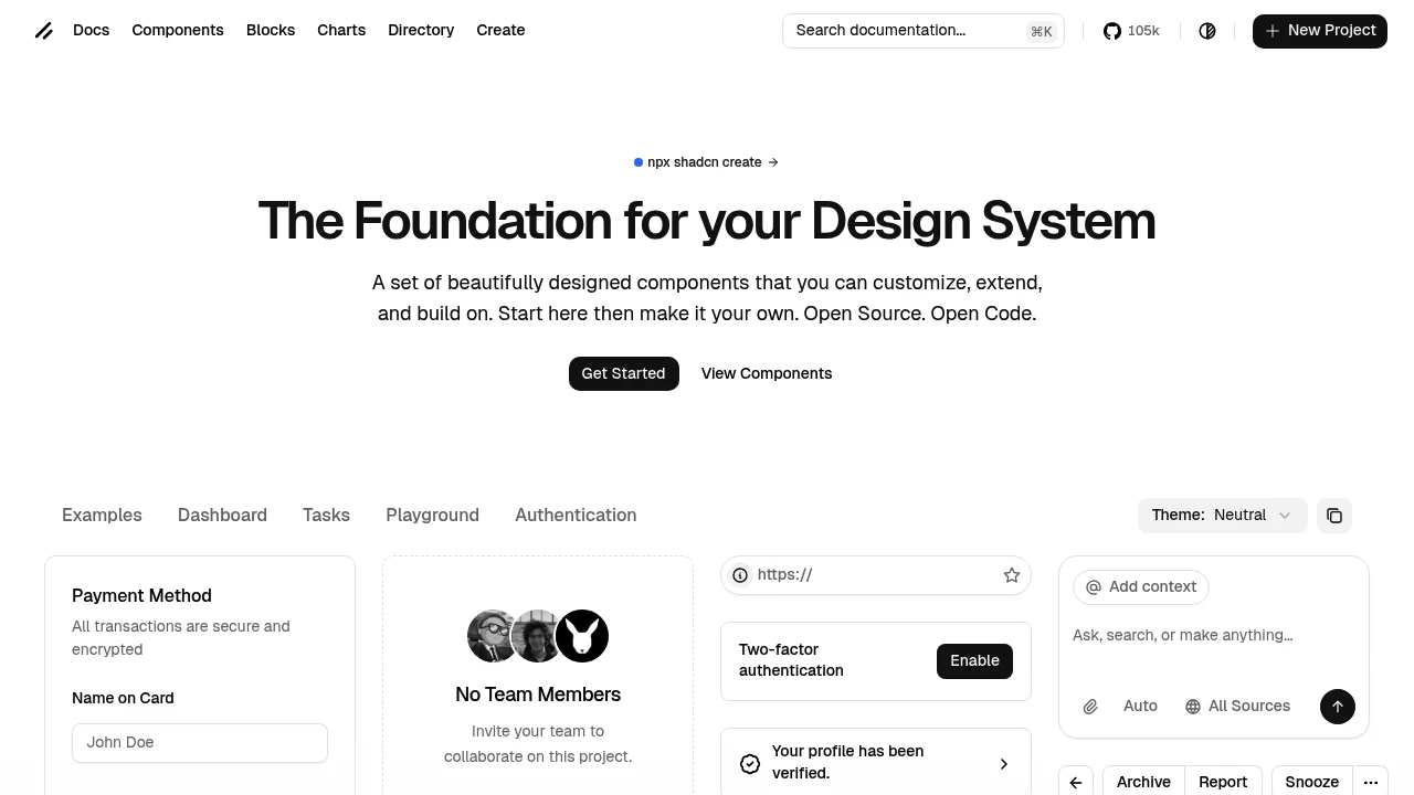
shadcn/ui changed how developers think about component libraries. Instead of installing a package, you copy components into your codebase—owning the code, customizing freely, never fighting a library's constraints.
Key Features:
- Copy-paste Components - Add to your project, not node_modules
- Radix Primitives - Accessible, unstyled foundations
- Tailwind Styling - Utility classes you control
- Full Customization - Modify anything, no library to fight
Why shadcn/ui dominates:
- Ownership - Your code, your modifications
- Consistency - Cohesive design system out of the box
- Accessibility - Radix handles the hard parts
- CLI Integration - Add components with one command
What's included:
- 40+ Components - Forms, dialogs, tables, and more
- Dark Mode - Built-in theming support
- Variants - Multiple styles per component
- Animations - Smooth transitions included
shadcn/ui is the default choice for React projects using Tailwind. The pattern of owning your components means you never hit library limitations. The tradeoff is maintaining those components yourself—usually worth it.
Categories:
Ad

 Emergent — An agentic vibe-coding platform that builds production-ready apps